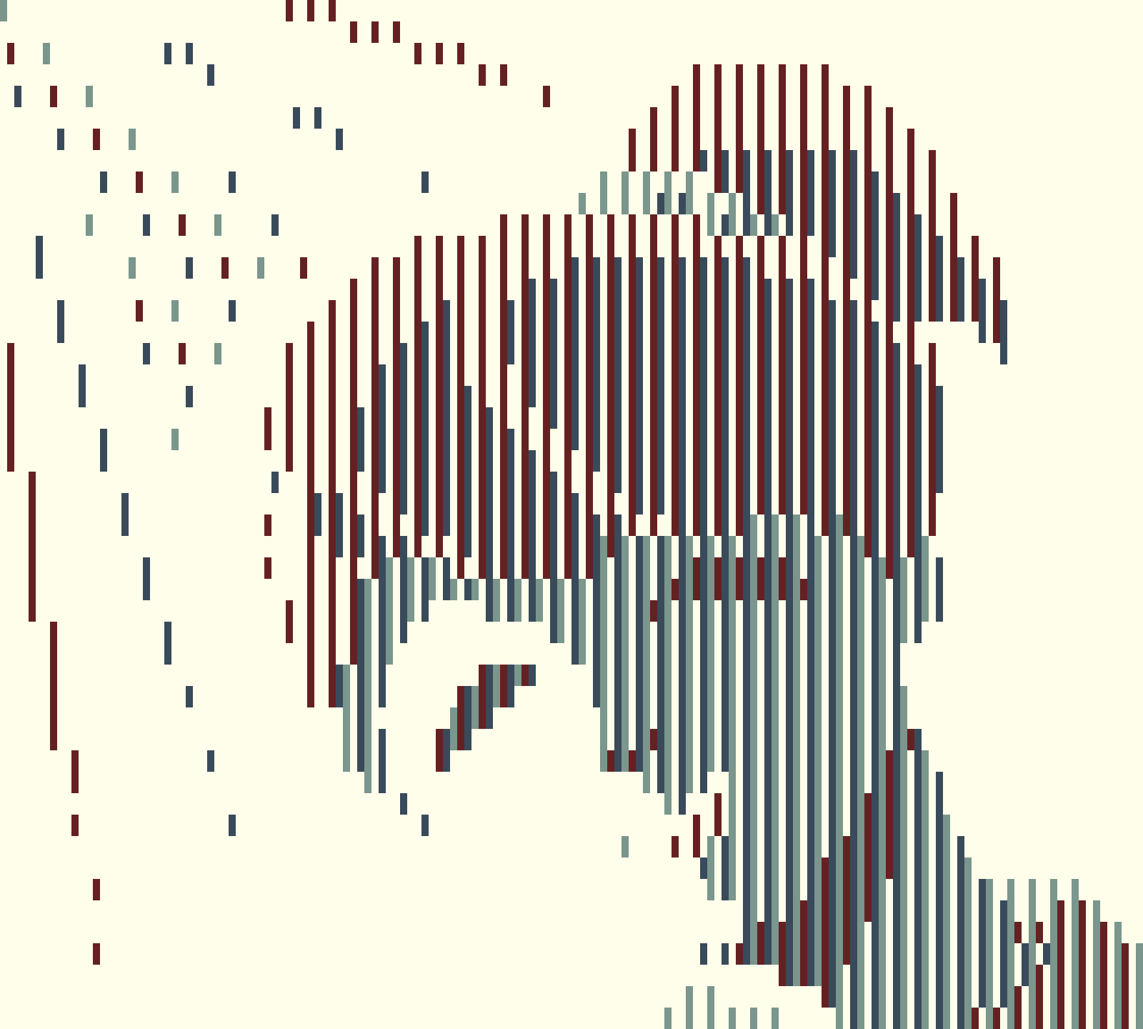
This was fascinating. I didn't expect to be surprised by such a good use of optical illusions again, after that submission last year, but here I am again saying "Wow". The use of colors really gives the impression that there is more than what you are actually seeing, similar to what happens with RGB monitors.
This reminds me that I didn't really like the "Blood Tide" color palette at first (apart from its peculiar name and its red tones that are stronger than they should be), but pixel art like this made me appreciate having chosen that palette even more.
Reading the information on this page, I remembered an interesting fact about the Game Boy. The Game Boy was one of the few video games at the time to have games transmitted to an LCD screen. Since almost everyone who had a TV at home at the time had a CRT, this meant that the developers designed the art style for such a screen, and not for LCD or OLED monitors like we have now. This made effects like Dithering common, since the PPU of an analog video game signal favored this type of image, so pixel art was not intended to be "square".
For the Game Boy this was different, mainly due to the cost of small LCD screens compared to CRT. However, with the launch of the Super Game Boy, compatible games would have to be designed for both screens.
I think it is up to each developer to highlight what sparks their interest the most. But this makes me wonder what other unexplored effects other types of screens have.
While I didn't intend on doing something as off the wall as last year, it did lean that way a bit since I did want to explore fun approaches to the theme. These jams are, in my eyes, an opportunity to get a little funky so I will likely take a similar approach next year as well.
Interesting stuff about the screen types, thanks for sharing! Talking about the use of the original Game Boy's LCD display made me think of the Game & Watch and what a different style that is. Video games, and handheld devices in particular, are a platform to build something that feels like so much more than displays. Displays that are often, in comparison, much smaller than the vast worlds that they spark in a player's imagination.
I like what you mention about each developer highlighting what sparks their interest the most. That feels particularly apt for this jam as I've seen a lot of different approaches to the art. Each piece reflects their respective creator and showcases something new to the viewer. It's been a blast seeing all of them!
I appreciate the kind words :) Given that it turned out to be more versatile of a system than expected, I'd like to try do to more with it (or a similar system). And I'd certainly be curious of how others would approach it!
WOAH I love this Eric! What a genius use of the restriction and palette!! :O I would love to see even more art like this, if you ever feel like creating more!
Thank you, glad you like it! I think i'd like to play around more with this sour of thing in the future, using set blocks to build something and all. Maybe RGB, maybe something else.
← Return to project
Comments
Log in with itch.io to leave a comment.
Really interesting and definitely a stand-out when it comes to technique!
This was fascinating. I didn't expect to be surprised by such a good use of optical illusions again, after that submission last year, but here I am again saying "Wow". The use of colors really gives the impression that there is more than what you are actually seeing, similar to what happens with RGB monitors.
This reminds me that I didn't really like the "Blood Tide" color palette at first (apart from its peculiar name and its red tones that are stronger than they should be), but pixel art like this made me appreciate having chosen that palette even more.
Reading the information on this page, I remembered an interesting fact about the Game Boy. The Game Boy was one of the few video games at the time to have games transmitted to an LCD screen. Since almost everyone who had a TV at home at the time had a CRT, this meant that the developers designed the art style for such a screen, and not for LCD or OLED monitors like we have now. This made effects like Dithering common, since the PPU of an analog video game signal favored this type of image, so pixel art was not intended to be "square".
For the Game Boy this was different, mainly due to the cost of small LCD screens compared to CRT. However, with the launch of the Super Game Boy, compatible games would have to be designed for both screens.
I think it is up to each developer to highlight what sparks their interest the most. But this makes me wonder what other unexplored effects other types of screens have.
Anyway, good job, I loved this pixel art!
I am glad you enjoy it!
While I didn't intend on doing something as off the wall as last year, it did lean that way a bit since I did want to explore fun approaches to the theme. These jams are, in my eyes, an opportunity to get a little funky so I will likely take a similar approach next year as well.
Interesting stuff about the screen types, thanks for sharing! Talking about the use of the original Game Boy's LCD display made me think of the Game & Watch and what a different style that is. Video games, and handheld devices in particular, are a platform to build something that feels like so much more than displays. Displays that are often, in comparison, much smaller than the vast worlds that they spark in a player's imagination.
I like what you mention about each developer highlighting what sparks their interest the most. That feels particularly apt for this jam as I've seen a lot of different approaches to the art. Each piece reflects their respective creator and showcases something new to the viewer. It's been a blast seeing all of them!
This is insanely cool!!! I wouldn't have thought it would turn out with such clear shapes either, but the image is very clear. I'm very impressed!
I appreciate the kind words :) Given that it turned out to be more versatile of a system than expected, I'd like to try do to more with it (or a similar system). And I'd certainly be curious of how others would approach it!
WOAH I love this Eric! What a genius use of the restriction and palette!! :O I would love to see even more art like this, if you ever feel like creating more!
Thank you, glad you like it! I think i'd like to play around more with this sour of thing in the future, using set blocks to build something and all. Maybe RGB, maybe something else.